In today’s digital world, web accessibility in app design is more important than ever. As apps become essential tools for communication, work, education, and entertainment, developers and designers are responsible for ensuring that everyone can use them, regardless of their unique ability.
Accessibility is not just about meeting legal requirements; it is about creating inclusive experiences that allow people with diverse needs to fully participate in the digital landscape. By prioritizing accessibility in app design, companies can reach a broader audience, improve user satisfaction, and demonstrate social responsibility.
This article explores why accessibility matters now more than ever, and how it shapes the future of app development.
What is Web Accessibility?
Web accessibility in app design means creating digital products that can be used by everyone, regardless of physical, cognitive, or situational limitations. In 2025, as mobile usage continues to grow across a wide range of users and contexts, accessibility has become a fundamental component of inclusive app design.
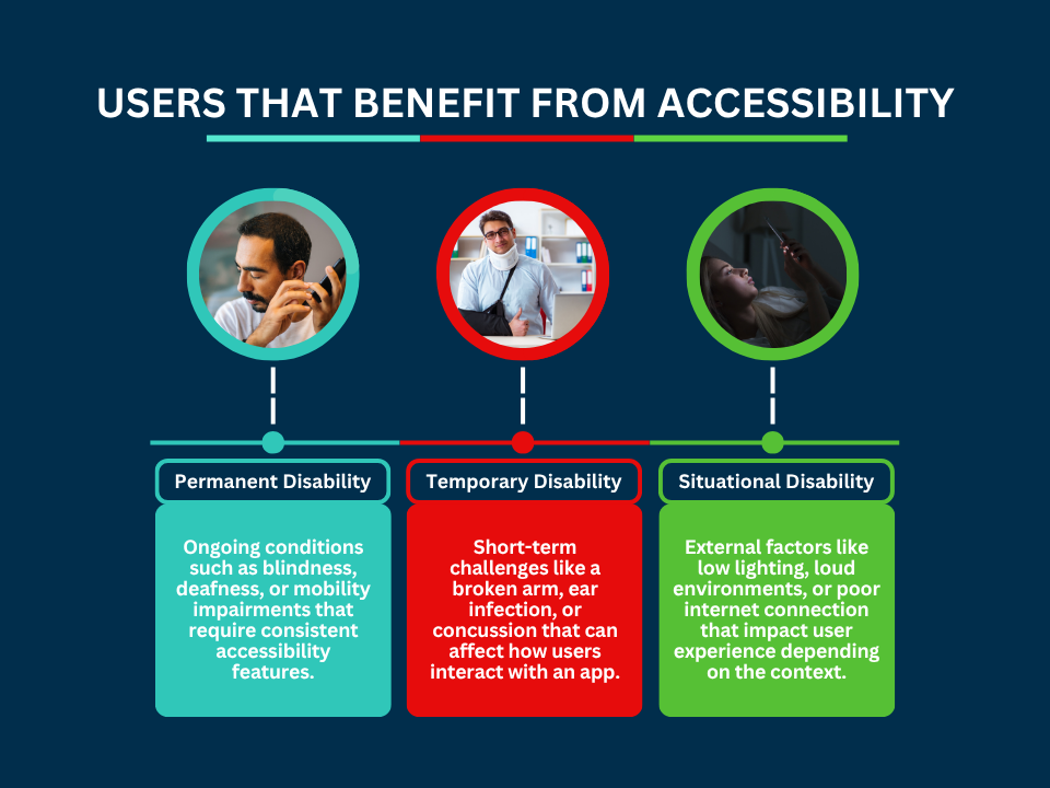
This involves supporting three key types of disabilities.
- Permanent: such as blindness or deafness.
- Temporary: like a broken arm or a concussion.
- Situational: including low lighting or limited Internet access.
An accessible app ensures that no user is excluded because of their abilities or circumstances. This includes people who rely on screen readers to navigate interfaces, individuals with motor challenges who use keyboard-only input or voice commands, and users in remote areas with low-bandwidth connections. Accessibility also benefits aging populations, non-native language speakers, and users in high-distraction environments.
Designing for accessibility means more than checking compliance boxes. It’s about enabling real people to interact with your app in meaningful ways. This includes thoughtful features like clear navigation, readable text, voice control compatibility, and content that adjusts to different devices and screen sizes.
By integrating accessibility into the design process, developers create more resilient, flexible, and user-friendly apps for everyone.
The Importance of Web Accessibility in App Design
Accessible design offers more than just an adherence to good practice – it is essential for fairness, compliance, functionality, and business success.
- Inclusivity: around 1.3 billion people globally (about 16% of the world’s population) live with a significant disability. Accessible apps empower these users to access core services like telehealth, education, finance, and digital wallets.
- Legal compliance: in the US, apps and websites fall under the Americans with Disabilities Act as places of public accommodation. Lawsuits targeting inaccessible digital products average 80–100 per week, with over 4 500 filed in 2023. Ensuring accessibility helps companies avoid legal risk.
- Enhanced user experience: accessibility features improve usability for all. For instance, captions built for deaf users also aid those who speak another language or use an app in noisy environments, boosting comprehension and engagement.
- Wider reach and retention: designing for accessibility expands your potential user base. People in low‑bandwidth areas, users with older devices, or those navigating in dim light can still enjoy reliable app performance. This fosters loyalty and reduces churn.
- Positive brand image and innovation: prioritizing accessibility demonstrates your commitment to social responsibility and ethical design. It encourages teams to think creatively, such as adding voice control or high‑contrast modes; features that benefit all users and inspire fresh ideas.
Accessible App Design Benefits for Businesses
Accessible app design is a powerful business strategy that supports long-term growth, enhances innovation, and positions companies as leaders in a digital-first economy. While accessibility is often framed as a legal or ethical concern, its commercial benefits are just as compelling.
- Market expansion: many users with disabilities face barriers that prevent them from using mainstream apps. By removing these barriers, businesses gain access to a large and often underserved market. According to the Return on Disability Group, the global spending power of people with disabilities and their families exceeds $13 trillion. Designing inclusively gives businesses a competitive advantage in reaching these consumers.
- Global readiness and cross-cultural appeal: accessibility features like clear visuals, audio alternatives, and readable content help make apps more adaptable across languages, cultures, and regions. This becomes especially important for companies targeting international markets or operating in areas where technology access varies widely.
- Future-proofing against tech shifts: as new devices, voice interfaces, and assistive technologies evolve, accessible design ensures your app is more adaptable. For example, apps that support text resizing or voice control are better positioned to integrate with wearable tech or smart home systems. Accessibility lays the foundation for long-term compatibility.
- Stronger procurement opportunities: many government agencies, educational institutions, and large enterprises now require digital tools to meet specific accessibility criteria. Apps that meet these standards are more likely to win contracts, partnerships, and vendor approvals in competitive bidding environments.
- SEO benefits: accessibility and SEO go hand in hand. Features like alt text, logical content structure, and clear navigation improve both usability and visibility in search engines. This helps apps perform better in search results, driving organic discovery and attracting new users.
- Reduced costs and greater efficiency: building accessibility into the design from the start prevents costly redesigns down the line. It can also reduce customer service inquiries by making the app easier to navigate and understand for all users.
How Can I Make My App ADA-Compliant?
Ensuring ADA compliance for mobile apps is essential for businesses that serve the public, particularly in sectors such as retail, healthcare, and education. Under the Americans with Disabilities Act (ADA), digital products like mobile apps are considered places of public accommodation, which means they must be accessible to users with disabilities.
To create a compliant app, designers and developers should follow the Web Content Accessibility Guidelines (WCAG) 2.2. This includes maintaining a minimum contrast ratio of 4.5:1 for regular text and 3:1 for large text, ensuring that content remains legible for users with visual impairments. Keyboard navigation must be supported so that users who cannot rely on touchscreens can still move through the app with ease. Compatibility with assistive technologies is also essential. Apps should work seamlessly with screen readers, such as VoiceOver for iOS and TalkBack for Android, by using clear semantic structure and properly labeled user interface elements.
Multimedia content should be handled thoughtfully. Avoid auto-playing videos or audio, which can be disorienting for many users. Instead, include captions for videos and transcripts for audio content to ensure accessibility for individuals with hearing impairments or those using assistive tools. Developers should also test their apps regularly, using tools like WebAIM’s WAVE and axe DevTools, to identify and fix accessibility issues early in the development process.
For companies looking to build inclusive, user-friendly apps that meet ADA requirements, AppIt Ventures offers expert services in ADA-compliant app development. Our custom solutions prioritize accessibility from day one, ensuring your app meets standards while delivering a seamless experience to every user.
Practical Steps to Improve Accessibility in App Design?
Whether you are building a healthcare platform, a learning tool, or a retail app, integrating accessibility from the start ensures a wider reach and a more inclusive user experience. If you’re wondering how to make apps accessible, the following steps provide actionable guidance for improving accessibility in mobile and web app design.
Color and Contrast
Begin by ensuring strong color contrast throughout your app. Body text should maintain a minimum contrast ratio of 4.5:1 against its background, while large text can meet a slightly lower threshold of 3:1.
This helps users with low vision, color blindness, or temporary impairments, such as screen glare.
Additionally, avoid relying on color alone to convey information. Use icons, underlines, patterns, or labels to help all users understand interactive elements, especially when indicating errors or clickable links.
Appearance
Design your interface with clarity and flexibility. Use legible fonts, adequate spacing, and visual consistency across all elements. Avoid cluttered layouts, and ensure that buttons, form fields, and navigation elements are large enough to be tapped or selected comfortably.
Consider how the interface appears in both light and dark modes, and allow users to choose their preferred view.
Navigation
Make sure every feature in your app is accessible via keyboard navigation. This is especially important for users with motor impairments who rely on keyboards or alternative input methods.
All interactive elements, such as buttons, links, forms, and menus, should be reachable using the Tab key and include a visible focus indicator. Your app should also work seamlessly with screen readers by using correct semantic HTML and ARIA labels where necessary.
Headings and Organization
Structure your content using clear, descriptive headings in the correct hierarchical order. Heading tags should follow a logical sequence without skipping levels (for example, using an H2 after an H1, not an H4).
Well-organized headings not only support readability but also make it easier for screen reader users to scan and navigate content efficiently.
Images and Media
Provide alternative text (alt text) for all images so that screen readers can describe the content to users who are blind or have low vision. For videos, include synchronized captions to support users who are deaf or hard of hearing. Transcripts for audio content such as podcasts also improve accessibility and usability.
In addition, always offer clear, visible pause or stop controls for any audio or video media to give users control over playback.
Interactions
Design all interactive elements with clarity and feedback in mind. Use distinct visual boundaries for buttons and input fields, and always include clear labels rather than relying on placeholder text, which disappears once typing begins.
When users take an action (such as submitting a form or making an error) provide immediate, descriptive feedback. Avoid requiring hover interactions, as they can be inaccessible to users on touchscreens or those relying on keyboard navigation.
Content
Language plays a major role in accessibility. Use plain language, and avoid jargon or overly complex sentence structures.
This helps users with cognitive disabilities, non-native speakers, and even younger audiences understand your app more easily.
Tools like Grammarly can help assess readability and grammar. When writing for diverse audiences, always aim for clarity and inclusivity.
Responsive Design
Your app should be fully responsive across all devices and screen sizes, including smartphones, tablets, and desktops. Users should be able to resize text without losing functionality or content visibility.
Make sure your layout adapts to zooming, and that all interactive elements remain usable when the screen is magnified. Test your app in different browsers, orientations, and resolutions to ensure a consistent experience.
Tips for Building Accessible Apps in 2025
Creating an app that everyone can use isn’t just about accomplishing a good design—it’s a necessity in 2025. Here are practical tips to help you make your app truly accessible from start to finish.
- Conduct user testing with diverse groups: involve people with various disabilities in your testing process. Their real-world feedback helps identify accessibility issues that automated tools might miss. Testing with users who rely on screen readers, keyboard navigation, or other assistive technologies ensures your app works well for everyone.
- Use accessibility tools during development: utilize tools like Contrast Checker and axe DevTools to catch common accessibility problems early. These tools scan your app for issues such as poor color contrast, missing alt text, and keyboard navigation gaps. Incorporating these checks throughout development helps maintain accessibility standards.
- Train teams on WCAG 2.2 guidelines: educate your design and development teams on the latest WCAG 2.2 standards. Understanding these guidelines ensures that accessibility considerations are integrated into every phase of your app’s creation. Ongoing training keeps your team updated with evolving best practices.
- Partner with experts like AppIt Ventures: work with accessibility specialists from the beginning. AppIt Ventures offers expertise in designing and developing ADA-compliant apps, ensuring accessibility is embedded from the ground up, saving time and resources.
- Monitor user feedback post-launch: after launching your app, actively gather and analyze user feedback related to accessibility. Continuous improvements based on real user experiences help maintain and enhance app accessibility over time.
To build an app that truly serves everyone, contact AppIt Ventures for expert guidance and support.